And So Is June and So Is the Second Quarter and So Is the Last 12 Months
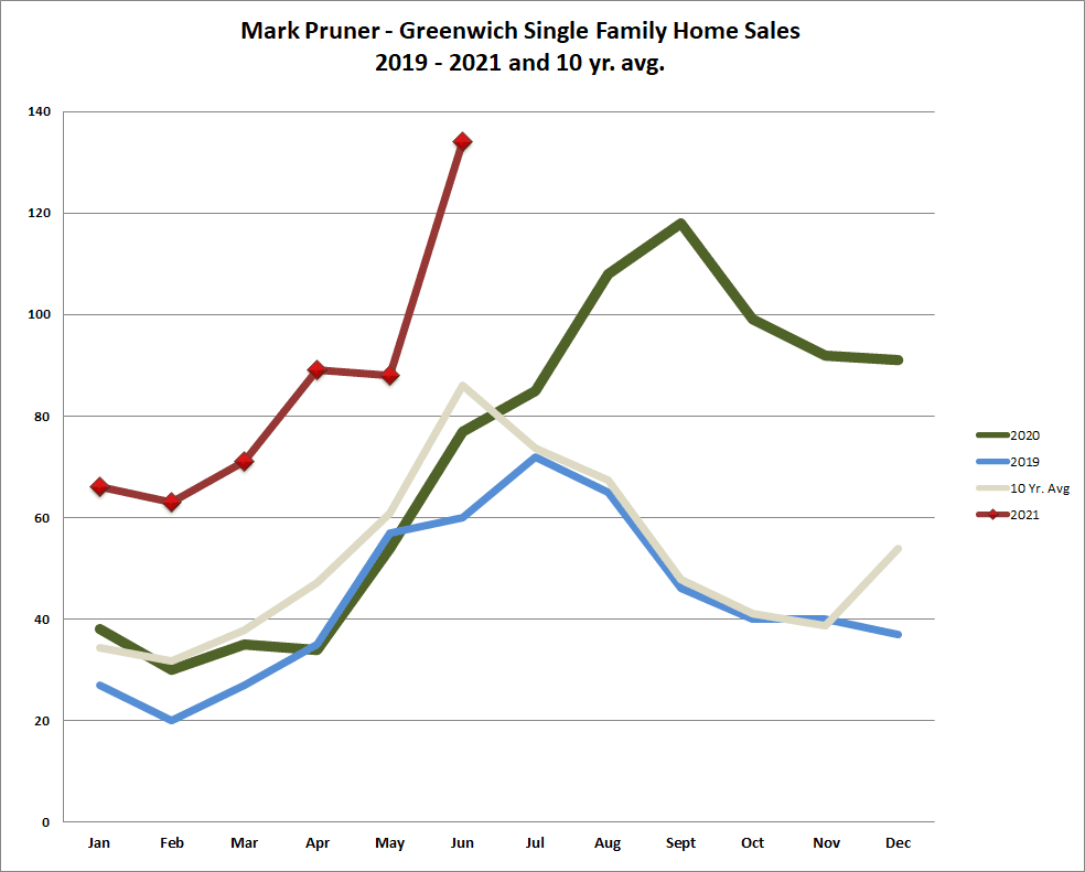
First the superlatives; June 2021, Q2 ’21, H1 ‘21 and the last 12 months were all time records in Greenwich and in most cases by a significant margin. For the month of June, we had 134 sales which blew away our prior record of 118 sales in September of last year. Prior to that we had had 114 sales in June 2011, which happened because the Connecticut legislature raised the real estate conveyance tax by a quarter of one-percent. (Greenwich sellers are very tax sensitive.) The to get a pure market demand record you have to go back to July 2003 when we sold 108 houses.
For the first half of this year, we had 511 sales, easily beating the prior first half record of 403 sales in the first half of 2007, which was the height of the go-go era of home sales in Greenwich. In the first half of 2021, four of the six months were all time record months and the other two months, January and March only saw higher sales in 2007 and 2006 respectively.
The even more remarkable sales numbers come when you look at the last twelve months from July 2020 to June 2021. For that period, we had an incredible 1,104 single family home sales. (In a normal year, we average about 650 sales a year.) The best we could do for any prior 12 month period was the 835 sales from the second half of 1999 to the first half of 2000, which is as far back as the Greenwich MLS online data goes.
As you might expect lots of us Realtors were pretty busy with all this activity. I was swamped last week and didn’t write have a chance to write an article, but did send in my charts. The Greenwich Sentinel publisher, Beth Barhydt, put in 3 charts, that I thought told a pretty compelling graphical story.
It turns out I was miserably wrong. Over the weekend, I was talking to two retired execs who looked at this kind of data every day during their career. Their comment about the graphs in the paper, “We saw them, but what the heck do they mean?” So, let’s take a look at just what information you can glean from these charts (and also what you can’t.)
The chart that Beth runs the most frequently, is monthly single family home sales for the last two years, plus the prior 10-year average. She and I likes it, because it’s what most people talk about; “How are sales doing.” To get a good feel of that start with the faint grey line, the 10-year home sales average. If the current and most recent month’s sales are above the grey line, we are doing well and if they sales line is way above the 10-year average we are doing very well.

However, if you look at the 2021 monthly sales, you will see that May 2021 had only 88 sales down from April’s 89 sales. That should not happen in a normal market. As the 10-year average shows our sales normally rise rapidly from their low in February to their annual high in June, so why did they move sideways in May. The short answer is that you can’t know. We can ask a bunch of agents, mortgage bankers and real estate attorneys and make an informed guess, but that’s all it is. (My guess based on a bunch of conversations is that’s of people took their first vacations in over a year in May as vaccinations became popular.)
May’s sideways move, means that June’s big jump is exaggerated. If you move 20 delayed sales from June to May then we get a more normal curve, albeit at a high level. The other thing that we don’t get, if you move these sales, is an all-time record as September 2020’s 118 sales would beat this month. We all like to see good records sets and writers like to lead with them, but look past these records and see if their might be a reason for them not directly related to market demand.
Another thing to note in the June sales is just how steep the line up is. If you look at the other two years of sales, even the huge second half of 2020’s sales, we don’t see any lines that steep. This usually means that the next month will not spike up as much.
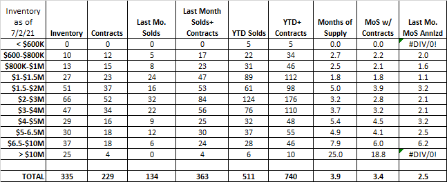
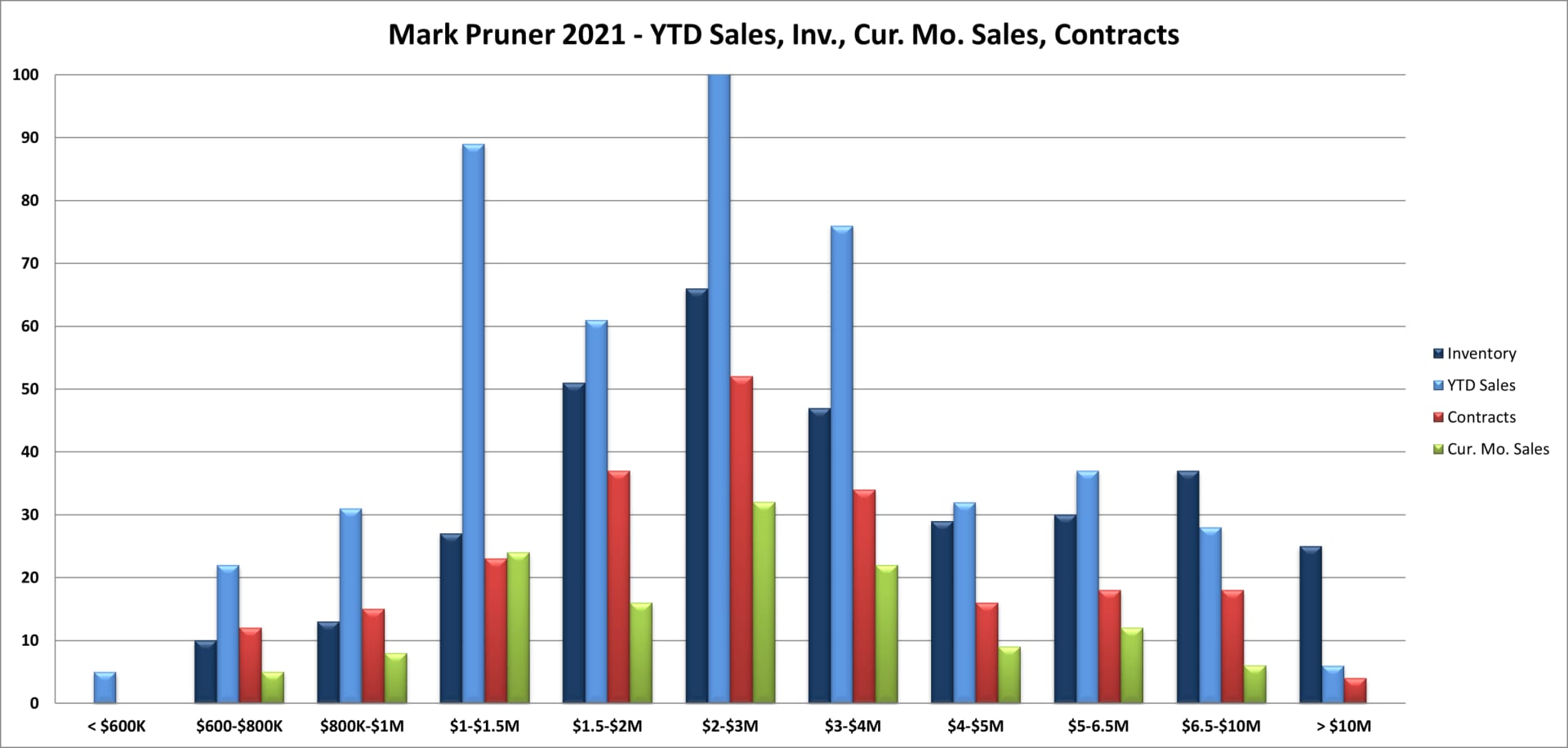
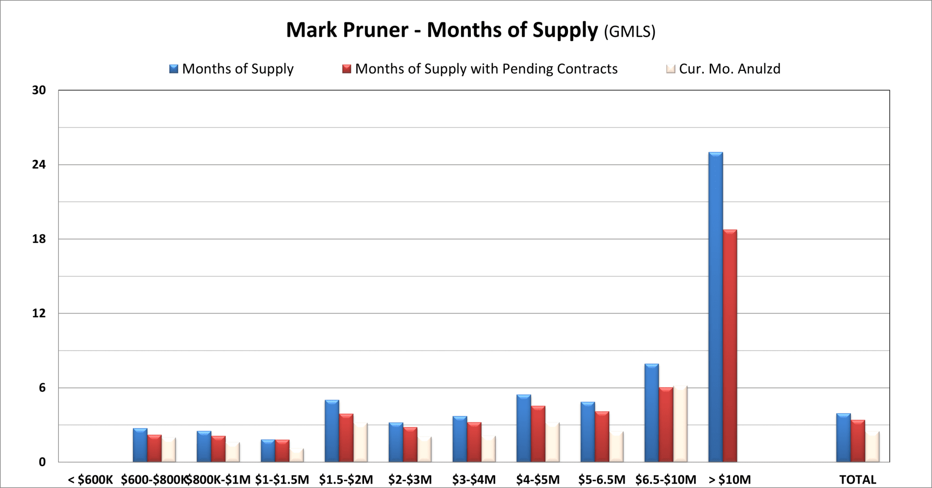
The chart that is more complicated is the inventory, sales, contracts and current months sales bar-chart. It has over 40 bars by price range. Some price ranges have a hump in the middle and some decline from left to right. In addition, sales year-to-date only go one way up, so the November chart looks nothing like the February chart even though both months are traditionally slow months for sales.
One thing you can tell by looking at this chart is where the inventory is. If you look just at the dark blue bars, you can see the most inventory is between $2 and 3 million dollars, and that would be wrong. The most inventory is between $1 and 2 million, but this price range is split into two price ranges. The reason for that, is that these are roughly the price ranges that buyers will look in. Rarely, will someone look at both $1.2 million houses and $1.9 million houses, but most buyers that are looking at $5.2 million homes will also look at $5.9 million homes. So, be careful comparing the heights of the bars if the width of the price ranges are not equal. For me the price ranges under $1 million are $200K wide and from $2 – 5 million are $1 million wide.
Another thing to look at is how sales, contracts and current months sales are doing within each price range. If contracts are higher than th current months sales, you can expect sales to go up in subsequent months, a sign of a strong market. If contracts and the current months sales are about equal that’s a sign of a slowing market.
Also looking for missing bars. In June we had no sales over $10 million. At the top end, we are seeing our only weak price range with 25 months of supply over $10 million and 25 listings. But, another thing to realize is that all things are relative. In June 2019, we had 70 months of supply over $10 million. Another thing to note that you can’t see from a static bar-chart is most sales in the over $10 million market has changed from the first quarter, when folks used to get big bonuses to the late third and fourth quarter in today’s market.
These first two graphs are like looking in the Hubbel telescope, the light you are are seeing is coming from the past. Last year when the market started to change rapidly from month to month and even week to week, I created the MP index, which while partially egotistical is shorter than saying., ‘the sum of all weekly sales, contingent contracts, pending contracts and contingent contracts becoming pending”. (In the old days we simply called a pending contract, a non-contingent contract.)
The first thing you’ll see when you look at the index is it jumps around from week to week, so you want to take a longer view. Clearly though when we have string of weeks when the index trend is up, the market is getting better. This almost always happen in the spring, but that didn’t happen last spring when weekly transactions in March and April were essentially sideways as Covid took hold.
In 2021, we started off with a busy January, pulled back a little and then climbed through the first week in May, followed by a sharp drop off in May. In June and so far in July our activity is looking like it is going to be more like the busy period in the second half of 2012. Now, that last statement is not to be trusted. Graphs aren’t an accurate predictor of the future.
Graphs can show you where you’ve been, they can even give you a decent sense of where we are, but we have way to many exogenous events, black swans and viri to expect that present trends will continue without change. They are useful for determining what you are facing, whether a buyer or a seller. I find them a lot more useful than a series of anecdotes and chance encounters with people. Sometimes you get a representative sample, but you could also meet the most depressed Realtors and the most estatic buyers and get the wrong impression of the market.
The best thing you can do, is to keep up a general knowledge of the market, so you can see when things are changing in your market, and hire a real estate agent who tracks all of this on a daily basis.